No. 64 Pixel Street
A downloadable game for Windows and Linux
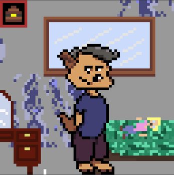
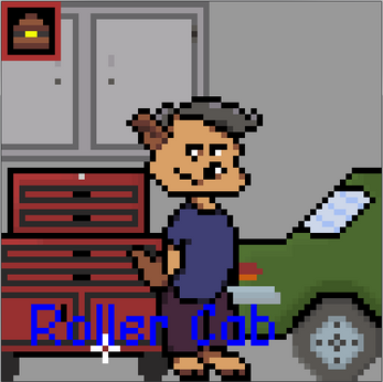
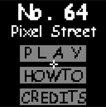
A Point-and-click Adventure type game in a 64x64 pixel format.
Escape the somewhat odd and musty old house of No. 64 Pixel Street.
There is only one way out. Can you find all the keys to unlock the door?
-- Made for Low Rez Jam 2019 --
Any feedback / bug reports would be greatly appreciated. This my first time around with a point-and-click and there could be some issues I haven't seen!
WARNING: Current version only supports 5 inventory items. Further versions will support scrolling inventory. For now, if you find a key, use it straight away! You can Press 'ESC' at any time to return to the menu and reset if you need.
HINT: One of the puzzles uses the jam theme 'Illogical Solution'
Credits:
All BGM - Tweaklab
All Artwork - Eloise N
Programming and Game Design - Warwick S (Me)
All SFX - Zapsplat.com
| Status | Canceled |
| Platforms | Windows, Linux |
| Author | Deexenigma |
| Genre | Adventure |
| Tags | 2D, GameMaker, LOWREZJAM, Point & Click |
Download
Development log
- Programming and Final ArtworkAug 14, 2019
- More programming, Artwork and HeadachesAug 11, 2019
- Inventory code nearing completion and new ArtworkAug 08, 2019
- Day Two - Art and PlanningAug 04, 2019
- First day of REAL developmentAug 03, 2019
- Inital Planning & ConceptsAug 01, 2019


Comments
Log in with itch.io to leave a comment.
Your game looks super cool, wasn't able to get far but I'll keep trying. I've found a bug when i try to enter the menu and then how to after starting the game I can't red the text since it gets constrained to 64 x 64 pixels. Also I'm not sure if combining objects is working properly as when I've right clicked an object it stays red until I've found the right combination and I can't do other things like light the bunsen burner.
Thanks for playing!
Your mention of the inventory is a real problem I fought for a long time. My suggestion is when selecting from the inventory make sure there's nothing behind it (I.e. a cupboard etc.) and select from the top half of the inventory 'box'. I've had a lot of issues with object layering. So likely when you're selecting from the inventory it's getting confused which item you're actually clicking.
By reading the text I assume you mean the text on the items? I wans't really able to find a 'good' font for the size restriction. I completely agree that some items 'hovertext' isn't the best.
I meant the instruction text (How to screen) in the menu, the object text seemed fine to me :)
Ah you're completely right. If I go into it, then out, then back in, it looks like some low-rez alien text... Yea thats... intentional ;)
I'm actually unsure. Something to fix in a further revision. It should render it the same each time.